
 Tiếng Việt
 English
 中文
Media guide
Thiết Kế Quảng Cáo Thang Máy: Cách Làm Rõ Thông Điệp Và Nhận Diện Thương Hiệu
Last updated: 26 Sep 2026
"This content is also important" is one of the reasons why advertisements are increasingly filled with text, images, and visual elements. Therefore, after multiple rounds of editing, the headline, product, offer, logo, and call to action often appear together with almost equal prominence.
However, viewers only interact with elevator advertisements for a limited time. Therefore, if too many details appear on the screen at once, viewers may leave the elevator without remembering what the brand wanted to convey. What should businesses keep in mind when designing elevator advertisements?
This article will help businesses determine what information needs to appear on the screen, how to arrange elements for easy message comprehension, and how to test samples before delivery.
Select the information you want to display on the screen.
Before arranging the layout, you need to distinguish between two layers of information: what viewers must understand immediately on the screen and what they can learn about later if they are interested.
The content on the screen needs to be sufficient for viewers to recognize the product or service being presented, its key benefits, and the brand message. Details that require more time to read, compare, or fill out can be redirected to a landing page. Viewers access this page by scanning a QR code or holding their phone close to the screen. NFC touch point if the screen supports it.
On screen: helps viewers understand quickly. | On the landing page: helps viewers learn more in depth. |
The main message about the issue or benefit | Detailed information about the product or service |
A name or image helps identify the product. | A complete list of features and how to use them. |
Name, logo, and brand identifier | Prices, terms, or policies apply. |
An invitation to learn more if the campaign requires it. | Application, registration or appointment form |
This segmentation isn't a fixed formula. If the price or promotional offer is the main message, you still need to put that information on the screen. The important thing is that each detail is included because it helps the viewer understand the advertisement, not because the brand wants to say everything at once.
The screen helps viewers understand and gives them a reason to be interested. QR codes or NFC tags help them continue learning.
QR codes and NFC cannot replace a clear message. Before scanning or tapping, viewers still need to know where the link will take them and what they will receive when they open the page.
Arrange the text and images in a clear order.
After selecting the information to retain, you need to determine which content viewers will see first and which will see later. Avoid overwhelming them with headlines, product images, offers, logos, and calls to action at first glance.
The order of placement should be based on the objective of the advertisement. For a promotional campaign, the discount might be prioritized; but if the goal is to increase awareness, the brand identity should take center stage to be remembered along with the message.
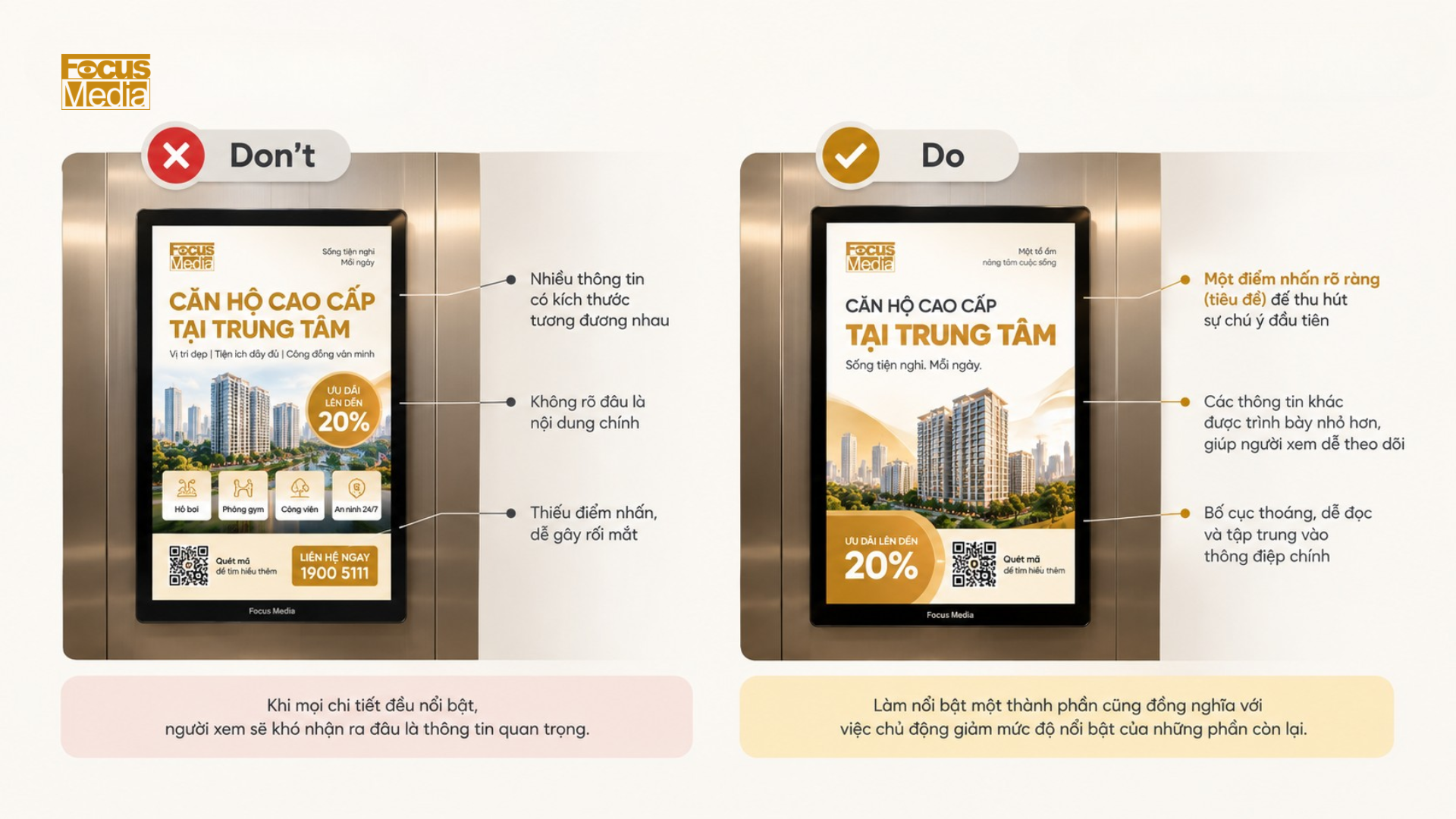
Create a first point of view
You should choose one element as the starting point for the entire layout. This could be the title, product image, or offer number. Its size, position, color, and boldness will help this element stand out from the supporting information.
If all the details are roughly the same size and color, viewers will have difficulty distinguishing the main content. Highlighting one element also means deliberately reducing the prominence of the rest.
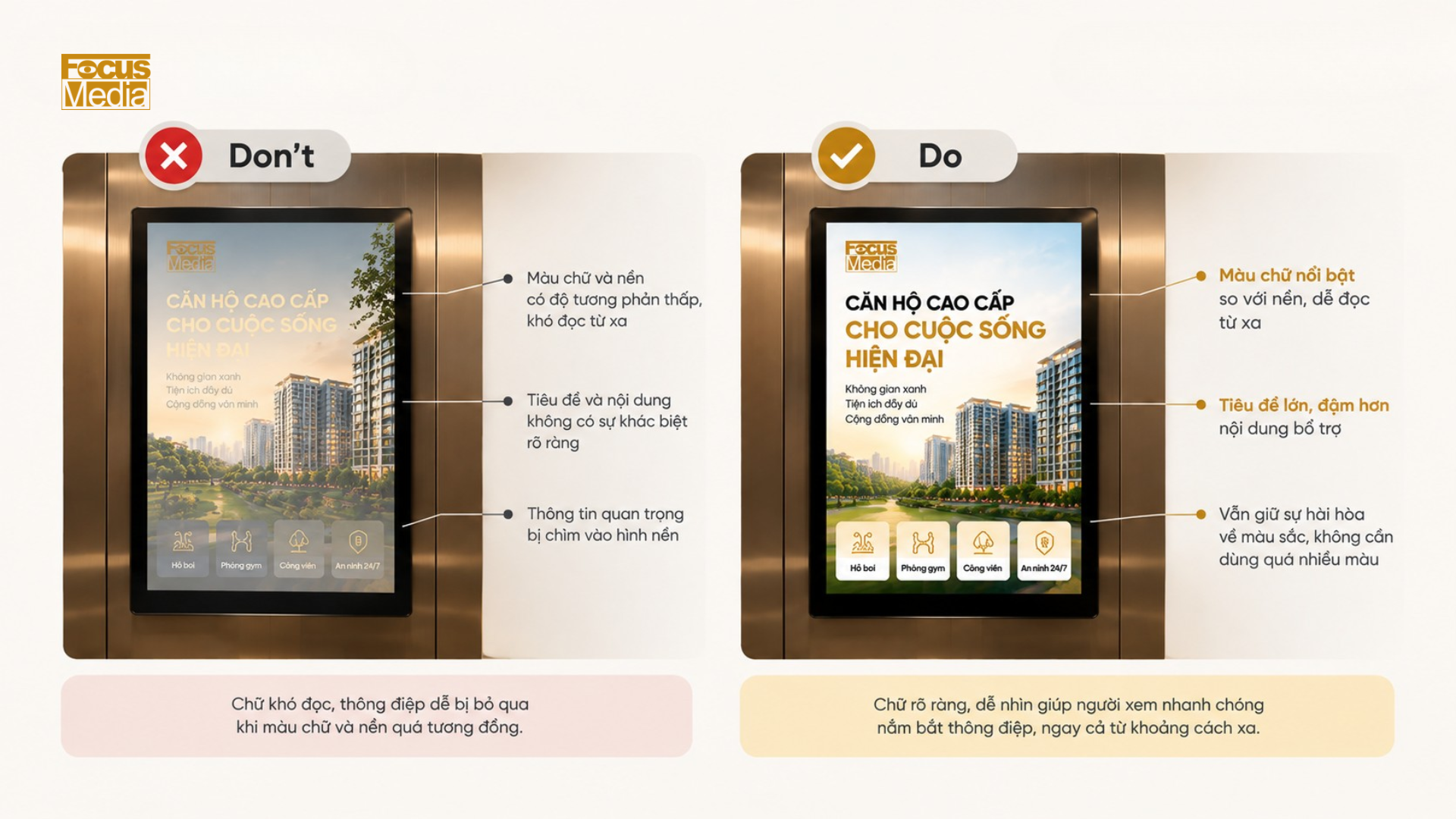
Keep the text clearly visible against the background.
The text color needs to stand out against the background color to make an impression on viewers from afar. For ads using animation or video, you also need to check the contrast in each scene. Easily readable text on a bright background might disappear when the image behind it changes to a similar color.
The distinction between headings and supplementary content can also be created using font size, boldness, or style. It's not necessary for each layer of information to use a different color.
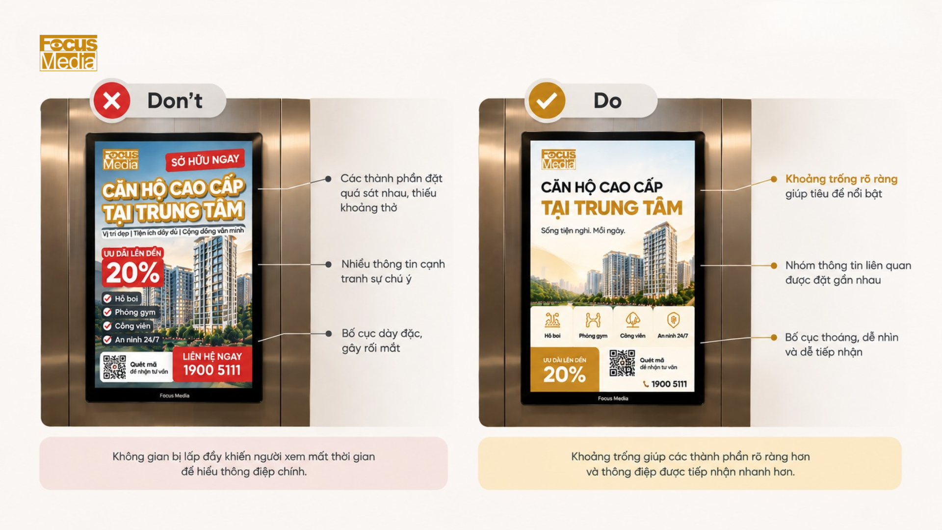
To leave space between the components
Whitespace isn't wasted space. It helps separate the title from supporting content, keeps product images from getting mixed up with text, and lets the viewer know which information belongs in the same group.
When all the space is filled, the elements tend to overlap or compete with each other. The ad copy may therefore contain more information, but it takes more time to understand.
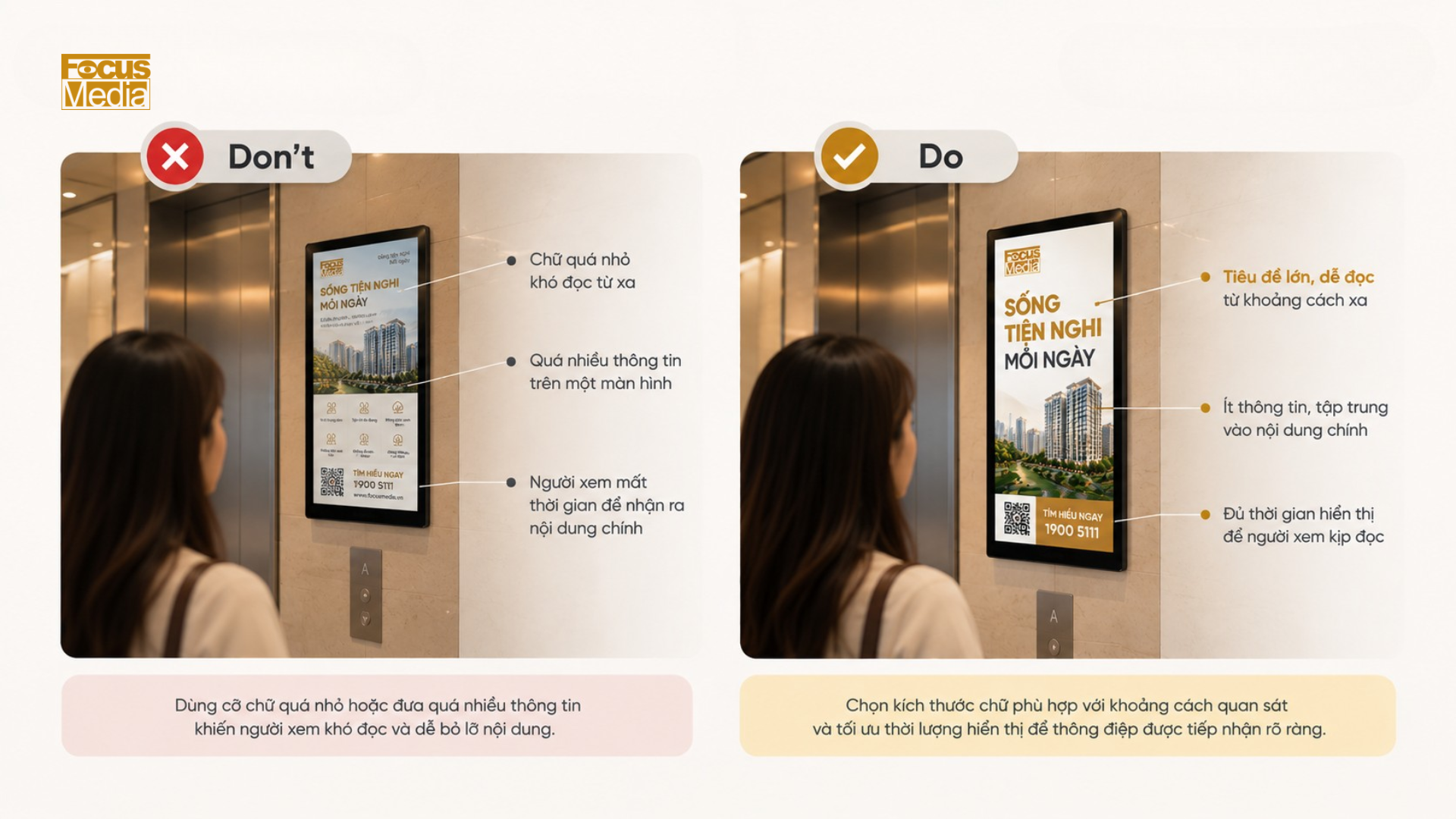
Choose font size based on viewing distance.
A single font size cannot be used for all elevator screens. Text that looks clear when sitting in front of a computer screen may appear too small in a real-world setting.
Therefore, you should display the advertisement on the intended screen type and stand in a position where viewers typically observe it to check its quality. If the advertisement consists of multiple scenes, each scene should also appear long enough for viewers to read all the text before the content transitions to another scene.
Help viewers remember the message and the brand.
The goal here isn't to make the logo as big as possible. You need to help viewers recognize the brand while they receive the main message.
Don't let the logo become a standalone detail.
You can place the logo near the main message area or use layout, color, and spacing to show that these elements belong together. The specific approach will depend on each brand's identity system and formatting.
Leverage product images to increase brand recognition.
For products with familiar packaging, shape, or interface, product images can also serve as a form of identification. In this case, you should retain features that help viewers recognize the product instead of choosing a flattering angle that obscures the name or distinctive mark.
Maintain consistency in identifying elements.
Color, typography, and visual style help create an advertisement that reflects the brand's unique identity. However, avoid incorporating every color from the brand's visual identity into a single design. Prioritize elements that are both familiar and easy to read, while also clearly conveying the message.
With multi-scene advertisements, identifying elements need to be maintained throughout. If each scene uses a completely different presentation style, viewers will have difficulty recognizing that they belong to the same content.
You can test the pattern with two questions:
- After a brief viewing, how do viewers remember what the advertisement is saying?
- Did they connect that message correctly with the brand?
Scan QR code or tap NFC: Create a complete journey after exposure to an advertisement.
After understanding the message and recognizing the brand, viewers can then learn more, receive offers, or sign up for a consultation. Each advertisement should prioritize one main action, rather than simultaneously asking them to scan a code, make a phone call, remember the website address, and search for the brand.
Determine what you want the viewers to do next.
The call to action needs to clearly tell viewers what they will receive. “Learn more” is quite general, while “View price list,” “Get a discount code,” or “Book a consultation” specifically indicate what awaits them in the next step.
The choice of action also depends on the campaign's goals. If the advertisement is primarily aimed at increasing awareness, viewers may only need to remember the brand or product name. QR codes or NFC tags don't necessarily need to appear on every advertisement.
Choose the most convenient access method for viewers.
QR codes are suitable when they are large enough, easy to read, and the viewer has time to open their camera to scan them. You also need to leave space around the code for easy phone recognition, instead of placing the code too close to text or other images.
With NFC, viewers simply need to bring their phone close to the touch point to open the link. Focus Media's elevator advertising screens incorporate NFC touch functionality , streamlining the process from viewing the advertisement to accessing the landing page.
Whether using QR or NFC, the instructions need to be clear. "Scan to get a discount" or "Tap to view the product" is easier to understand than simply placing a code or icon on the screen and expecting the viewer to guess.
Keep content seamless after a scan or tap.
The page that opens should continue with the exact content that just appeared in the advertisement. If the screen shows a specific product but the link opens a general homepage, the viewer has to find the information themselves.
For example, the invitation to "View price list" should lead directly to the price list; "Get discount code" should open the correct code redemption page. The fewer search steps required, the easier it is for viewers to continue with the action suggested by the advertisement.
After determining the action and destination, you need to test the entire experience under real-world usage conditions before delivering the sample.


Comment (0)
Related News


 Contact
Let Focus Media Vietnam
Bring your brand into urban life
Share your campaign objectives. Focus Media Vietnam will advise on how your brand can appear at relevant touchpoints within the building and connect viewers to landing pages, e-commerce platforms, apps, or digital content.

No comments yet. Be the first to share your thoughts.